Producing an abstract is NOT an easy thing to do. While applying pigment to ground may not take very long – coming up with the image itself can be a far more time consuming activity.
So I am going to briefly look into one aspect of abstract work – the use of colour … as part of the abstract progression.
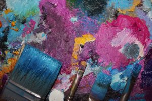
Let us break down the constituent parts of utilizing colour.
1. Tone
2. Hue and colour combination
3. Colour balance
Tone
This can portray important elements such as contrast, distance, loudness, and texture. A very worthwhile exercise is to carry a small hardbound watercolour paper book, a tiny container of black watercolour (two plastic bottle tops of different size so that one can fit into the other), a small watertight screwtop vessel filled with clean water, and a small paintbrush (an old fairly fine sable with most of the wooden part cut off and sanded smooth). Seek to find a visual of any of the above elements – say “contrast”. Once you have found something that contrasts with another try simply painting the contrast without necessarily portraying anything – just try to produce the contrasting relationship.
Hue and colour combination
This could (and has for me!) take a lifetime of study. However, the fundamental sections include tints, harmony, disharmony, complimentary, and combinations. I refer to the book, colour pot, water bottle, and brush again only this time instead of the pot containing just black have a pot with medium cadmium yellow, crimson, and cobalt blue – nothing more. This is one of the most fscinating of exercises you will ever carry out, because it will force you to mix these colours to produce ALL other colours – remember to use the white of the paper for white. Hunt out a visual that applies to one of the sections mentioned above and seek to find varieties of tints. Look how nature harmonizes colours very specifically – make careful notes of these. Try and obtain a personal understanding of what you see as harmonious and disharmonious colours.
Colour balance
I have already mentioned harmony, but in this section I want to concerntrate on complimentary colours. We are entering the scientific world of colour theory – and here we need to take note of the specific combinations like red/green, orange/blue, yellow purple. Careful consideration must be taken when the complimentary combinations are utilized. You will have to decide on what you want the viewer to experience. For instance – you can give them quite a headache … and even cause migraines if you combine both colours at their strongest. Many years ago when VAT was first implimented in the UK as a protest some businesses used bright red ink on bright green paper in order to cause reading difficulties for the Inland Revenue. Try it. Try other combinations. If you desaturate one of the colours (either adding a little black or white) you will find the other colour becoming much more bolder and louder. One other experiment is to add a third colour – say red and green separated by a line of black, orange and blue separated by a line of deep red. Test out other combinations for yourself … and ALWAYS make a note of what you do.
With all these “try-outs” see how the colours vary if you try increasing (or decreasing) the area of one colour. Different textures will also add another “colour”.
When it comes to applying the paint, be fearless and bold – even while you produce something delicate.
Finally, here is a piece of advice I was given many years ago, and have never forgotten: Whenever you experiment like this be sure to always complete what you have started – even if it is a simple exercise. And if you truly want to succeed then you must always be painting – when you are ill – paint, when you are angry, sad, frustrated – paint, and when you simply do not feel like painting – then that is the one time you should paint. Never stop yourself painting. If you do not stop yourself then there WILL come a time when you find that you cannot STOP painting! …A painters paradise!!
Submitted by:Tim SeawardTim Seaward is the author of “Abstract Colour – How to use it”. He is also a practicing fine artist living and working in the UK. Visit his site to find out exactly what he paints. http://www.ablot.com or mailto:tim@ablot.com |