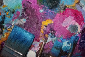
Much research and experimentation has been done on color and how it can effect a persons mood and behavior. Certain colors can calm a person, while others can stimulate excitement or cheerfulness. That being said, you may want to think carefully on the type of color scheme you choose for your next painting. This article will talk about five different color schemes you can use to plan out your next painting. The tips in this article can be applied to any painting medium.
Painting is all about harmony. Harmony in a painting is when the arrangement of colors and objects are pleasing to the viewers eyes. As a painter you can either put too much into a painting or not enough. If your painting is too chaotic you may scare the viewer away. On the other hand, if your painting lacks something, it may be perceived as boring, and your viewer will not be engaged, so it’s important to have balance in your color arrangements.
ANALOGOUS COLOR SCHEME
This color scheme uses colors that are next to one another on the color wheel. With an analogous color scheme, one color is usually the dominant one, while the others serve as an accent to the dominant color. You are limited in colors when using this scheme but that does not mean your paintings have to be boring. Just vary the intensity (how dull or bright a color is) and value (how light or dark a color is) to make your painting more interesting and pleasing to the eye. An example of three colors next to each other on the color wheel, that can be used in an analogous color scheme are orange, yellow and yellow-orange. Use only a few different colors with the analogous color scheme. If you add too many, you may destroy the harmony in your painting.
COMPLEMENTARY COLOR SCHEME
The complimentary color scheme is a good choice if you want strong contrast in your painting. Complimentary colors are colors that are opposite each other on the color wheel. Examples of complementary color schemes are reds with greens, oranges with blues and violets with yellows. You shouldn’t feel limited when using this color scheme. For instance, instead of using plain orange, you could use colors on either side like red-orange and yellow orange. Instead of using plain blue, you could use combinations like blue-violet or blue green. You could also vary the intensity and values as well. It can be difficult to create balance with this color scheme. To avoid ruining harmony, choose one dominant color and use the complimentary color as accents. For instance in a yellow and violet complementary color scheme, you could make the main subject and background violets and accent remaining parts of the painting in yellows.
TRIADIC COLOR SCHEME
The triadic color scheme uses three colors that are evenly spaced or equidistant from one another on the color wheel. This scheme produces strong contrast but still retains harmony. This color combination is more challenging for beginners. You can get carried away by making all three colors too intense thereby destroying the balance in your painting. You should allow one color to dominate and use the two other colors to accent the rest of the painting.
MONOCHROMATIC COLOR SCHEME
This color scheme is probably the easiest for beginners to work with. The monochromatic color scheme uses variations in value and intensity of only one color. Beginners like this color scheme because they only need to create a value plan using one color, which makes things a lot easier. Your painting will not be as exciting as other schemes that utilize more than one color, but your painting will produce a peaceful and soothing effect.
SPLIT COMPLEMENTARY COLOR SCHEME
The split-complimentary color scheme uses three colors and is a twist on the complimentary color scheme. Instead of using the colors compliment, you will use the two colors adjacent to its compliment on the color wheel. For instance, Red, Yellow-Green and Blue-Green could be a split complimentary color scheme.
Don’t let color theory intimidate or discourage you. Working with color in your paintings takes some getting used to. With time and practice you will begin to develop the eye of a good painter. A great way to learn more about the use of color in paintings is to view the art of experienced painters. Make some plans to head out to a museum or visit an online gallery. God Bless and Happy painting!
Submitted by:Russell NealIlluminations Lighting and Design multi-specializes in a variety of indoor, outdoor, high-end, and landscape lighting design services. ILD is also a licensed electrical design and repair firm. Visit http://www.illuminationslighting.com/art-lighting-as-art.htm and http://www.illuminationslighting.com for more details. |


